Is your online shopping cart having abandonment issues? Why would someone take the time to browse your site, select an item, and then not purchase it? The better question to ask is what you can do about it.
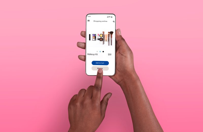
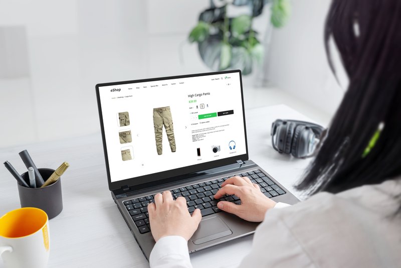
In the first quarter of 2024, the overall cart abandonment rate was 83%. The rate was higher for mobile users (85%) than it was for computer users (75%). This is a major problem for online retailers. After all, the average conversion rate for an eCommerce site is only 1.84% to 3.71%. eCommerce stores can’t afford to let potential sales slip through their fingers.
People abandon their carts for several reasons. For instance, your checkout page may be clunky, complicated, or hard to navigate. Users may also bounce due to surprise additional costs or the extra steps needed to complete a transaction.
If your website draws huge traffic, but customers still leave without finishing a purchase, it’s time to take a closer look at your online shopping cart experience. Here are some techniques to try.
Build a Powerful Mini Cart Experience
A mini cart is an interactive, sticky display that appears on the sidebar. It gives a condensed overview of items in the online shopping cart so customers can manage their selections without leaving the current page.
This tiny but mighty feature adds a lot of value. It gives customers a quick peek at what they’ve added without disrupting their browsing flow. They can track order summaries and make changes as needed. It’s also a clever way to keep the customer experience fluid—shoppers can complete purchases directly from the mini cart or continue adding.

A mini cart brings transparency to the cost as well. Extra costs such as shipping, tax, and fees are the number one reason customers abandon their carts. Keep all the essential order details in the mini cart, including the final cost and expected delivery date, to drive conversions. This is also a good place to nudge buyers with discount coupons and promotional deals.
Another effective way to utilize your mini cart is to give “People Also Bought” recommendations for a higher average order value (AOV). You want an eCommerce store that gives “Also Try” and “Best Seller” recommendations for related products in its mini cart. This lets customers place the order in just a few clicks.
This small tool can reduce the friction in a user’s shopping journey. Be sure to test different nudges to optimize their experience. Also, give your customers the option to expand or collapse the mini cart to adjust their browsing experience.
Reduce Information Capture in Your Online Shopping Cart
Shoppers only spend an average of 54 seconds on a page. Clearly, no one likes to fill out lengthy forms that ask for personal information. It’s enough to make a full 25% of customers hit the back button and abandon their online shopping carts.
Keep your checkout page short and sweet. Combine the billing and shipping information, where users are often asked to add their name, address, and phone number twice. Your customers should go from cart to billing and shipping details to payment page. In just these three steps, you can capture all the essential information.
Avoid extra steps, such as asking them to make an account or verify their email. This saves their time and reduces friction, so they’re more likely to complete the purchase. You can also:
- Enable the autofill option.
- Let users check out as guests.
- Save information for express checkout in the future.
Remember, the longer it takes to check out, the more time your customers have to second-guess their purchase. You can always gather additional information (birthdays, anniversaries, etc.) later on, once you’ve won your customer’s trust and loyalty.
Utilize Breadcrumbs in eCommerce Shopping Carts
If you have multiple product pages, a user might get lost and forget about their intended purchase. Breadcrumb navigation shows their location and helps them go back from the product page to the parent page. Such a clear path is an important part of the user experience and makes site navigation a breeze.
In an online shopping cart, the breadcrumbs let users move back and forth from shipping to payment pages to modify details as needed. This reduces confusion and frustration and leads to smoother checkout experiences. When customers can easily find their way around your site, they’re more likely to complete their purchase and come back for more.
Keep the breadcrumbs simple, clear, and consistent throughout the website. Use descriptive labels for each page and make them clickable. Customers should be able to jump back to any point in their journey with ease.
Create Cart Abandonment Workflows
Don’t just let a shopper leave your online shopping cart empty-handed. Create a cart abandonment strategy to re-engage them. This starts with an exit-intent popup when they try to click out of the cart without completing the purchase. Offer them an incentive to close the deal.

If prospects still abandon your page, the next step is to retarget them with ads. These ads give them a friendly nudge to come back and finish their purchases.
Send them reminder emails as well. Make them personal: address customers by name, include an itemized list of their cart, sprinkle in some urgency, and throw in a tempting offer to seal the deal. Think: a one-time discount or free shipping. Add a link directly to the checkout page. Social proof, such as product reviews and photos of happy customers, can also help.
It’s essential to time your emails right. Send the first email within 24 hours and a follow-up message a few days later. This keeps the momentum going but doesn’t overdo it. If they’re still not ready to make a purchase, the next email in your funnel should be an invitation to sign up for your newsletter. Then, send them regular offers.
Optimize Your Shopping Cart With Zobrist
Optimizing your online shopping cart experience is a necessary step to increase sales. From the initial browsing stage to the final checkout, every interaction matters. Refine the user’s journey, minimize friction, and give them exciting deals to help them finish their purchase.
But optimization doesn’t stop there. To truly understand and address the reasons behind cart abandonment, businesses need insights into user behavior. Zobrist provides an analytics solution that helps businesses learn why (and where) customers drop off and identify areas for improvement. By integrating Zobrist’s analytics tool with your eCommerce website, you can unlock a deeper understanding of your customers and take proactive steps to boost their experience.
Are you ready to take your online shopping cart experience to the next level? Book a free consultation today and unlock the power of data-driven optimization.


